How SEO & UX Work Together: Designing for Humans, Bots, and AI Answers
Getting The UX & SEO on the same team
UX and SEO have spent years working in parallel corridors, waving politely while heading in opposite directions. Now the walls are thinning. Search engines model how people behave. AI systems study what keeps users engaged. Visitors drift toward whatever feels intuitive, fast, and helpful. Suddenly the work of designers, strategists, and search specialists is stitched together whether anyone planned it or not.
Before diving into tactics, it helps to level-set.
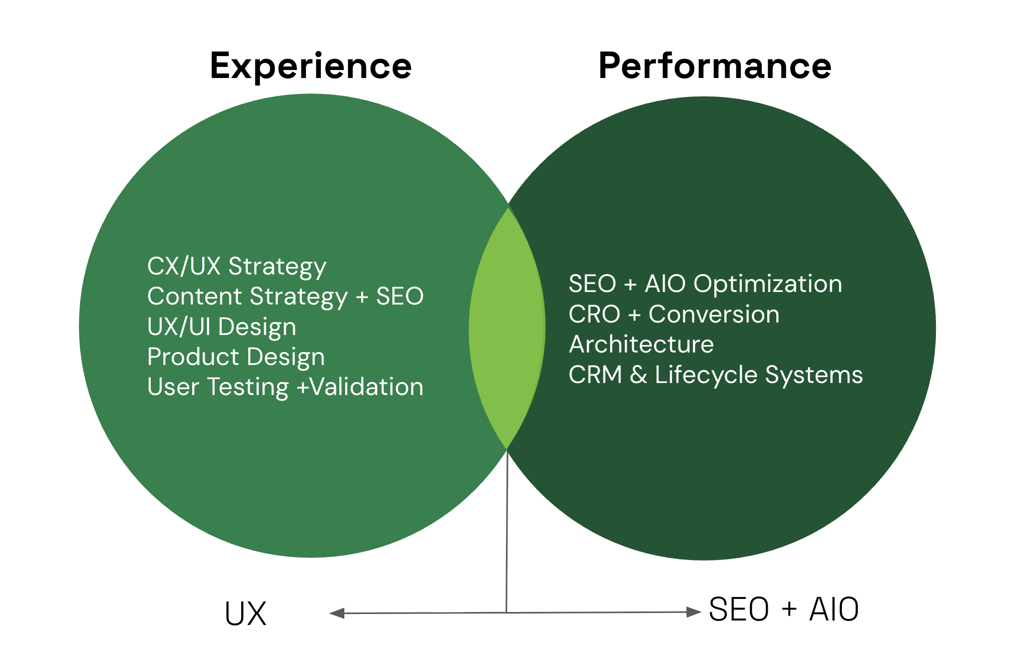
- UX focuses on how people move, read, tap, decide, and feel inside an experience.
- SEO focuses on how pages earn visibility, relevance, and authority.
- AIO brings in the growing layer of AI-informed optimization, where insights from models help teams understand intent, structure information, and test ideas at scale.
The central idea is simple: when experiences delight actual humans, they tend to perform better everywhere else. Search engines notice. AI systems notice. Conversions notice. This guide gives you a practical blueprint for aligning UX, SEO, and AIO so every page serves both the visitor and the algorithmic critics watching from the rafters.
If your teams have ever tugged in different directions, this is the map that helps everyone row together
Download Our Enterprise AI Enablement Best Practices Playbook
Why UX and SEO Are Inseparable Today
Search used to be a one-way street: type, list, click. Now search engines treat interactions as signals about whether a page actually solved a user’s problem. They look at engagement, navigation patterns, speed, and mobile behavior to judge relevance. Those are the same signals user experience designers optimize for.
If you chase keywords without matching the real need behind them, you get visits that leave immediately, little engagement, and poor conversion. That wasted attention can weaken topical authority over time. At the same time, AI-powered features and assistants favor content that answers clearly, quickly, and with credible context. That means relevance equals more than keywords, it equals experience.
Put simply, SEO that ignores UX can win clicks and lose value. UX that ignores search will stay hidden. The intersection is where durable value lives: satisfied visitors, meaningful signals, and better outcomes for both organic channels and product success.
Understanding Intent: Foundation of Both UX and SEO
Search intent is the shared operating system for UX and SEO. When teams disagree on what a page is for, everything downstream degrades: design choices feel arbitrary, content bloats, and traffic arrives without conviction. When intent is clear, decisions simplify. Layout, copy, hierarchy, and calls to action all start pulling in the same direction.
At a practical level, most queries fall into a small set of intent categories. The mistake is not knowing them. The mistake is treating them as labels instead of behavioral cues.
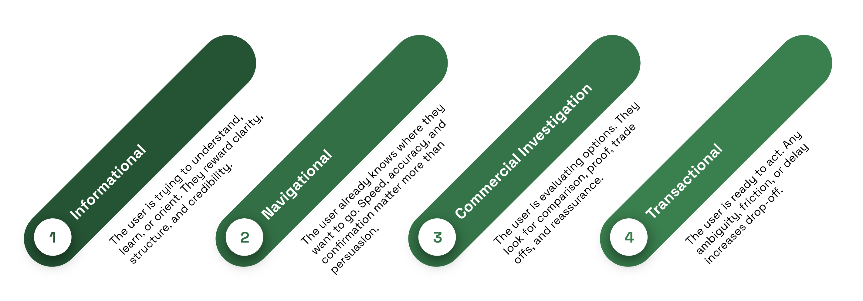
Strong UX mirrors intent instead of fighting it. An informational page should surface the answer quickly, then offer depth through scannable sections and logical next steps. A commercial investigation page should make differences explicit and reduce cognitive load through side-by-side framing. A transactional page should remove uncertainty, show cost and effort clearly, and make the path forward unmistakable.
Where teams level up is in how they detect intent. Keyword lists alone flatten nuance. AI-assisted research helps surface how intent evolves across phrasing, context, and time.
- Query clustering reveals when similar keywords actually represent different expectations.
- SERP feature analysis shows what search engines believe satisfies the query.
- Conversational data exposes the language people use when they are confused, comparing, or ready to commit.
Those signals should directly inform page structure, microcopy, and CTAs. When intent, design, and content align, engagement improves naturally. Visitors find what they came for. Search systems see satisfaction. Conversions follow without being forced.
Content Experience: Readability, Structure, and Trust
Good content does more than rank or read well in isolation. It guides attention. It answers questions in the order people ask them and it earns enough trust that readers are willing to keep going.
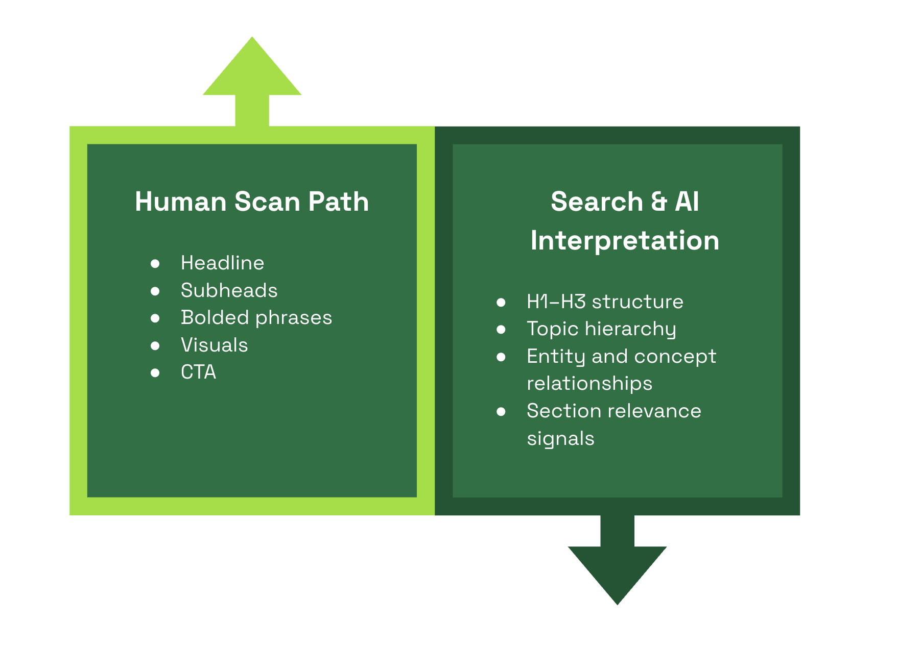
Most visitors don’t read linearly. They scan, pause, skip and return. That behavior should shape how content is structured from the start. Pages work best when the information hierarchy reflects what someone is hunting for, not how the organization thinks about the topic. Headings should signal value quickly and accurately because they are often the first real interaction a user has with the page.
A few fundamentals consistently separate content that works from content that feels heavy:
- Clear, descriptive headings that match common questions and scanning patterns
- Short, direct paragraphs that respect limited attention
- Plain language that explains without oversimplifying
- Visuals that clarify concepts or relationships instead of filling space
- Obvious authorship and topical framing that establish credibility early
Headings do double duty. They guide scanning behavior for people and provide structural signals for search engines and AI systems. The best headers describe the section in plain language using terms people actually search with, without sounding engineered. When UX clarity and SEO accuracy align, both audiences understand the page the same way.
Site Architecture and Navigation: Helping Users and Crawlers
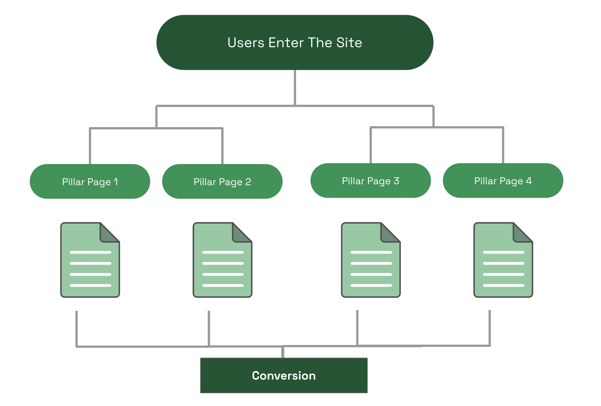
A logical architecture helps everyone. Think of the site structure as a map that connects discovery to decision. This is especially important when you consider that the vast majority of users enter a given site on a page other than the homepage.
Clarity of site architecture is important for wayfinding, logical cross-linking, and discoverability of new content. Good UX is fundamentally about minimizing the effort required to achieve a goal. Navigation and site architecture should be seen as the path users need to walk to achieve that goal. Clear site architecture and navigation reduce “choice paralysis”, lower bounce rates, and reduce user cognitive load. It’s just good UX.
Best practices:
- Keep categories simple and consistent so users and crawlers find predictable paths. Content that is topically grouped is prioritized by AI overviews and crawlers. Minimizing clicks by using clear categories helps everyone.
- Use clear navigation labels that reflect user language, not internal jargon.
- Internal links should serve journeys, not just SEO. Link from helpful contexts to relevant next steps.
- Breadcrumbs and structured data help both orientation and crawlability.
Move from the page centric mindset to experience flows. Map common journeys from discovery to action. Support those journeys with recommended content, progressive disclosure, and gentle nudges. For example, a discovery article can link to comparison pages, then product or sign-up pages, forming a logical funnel that humans follow and crawlers can infer.
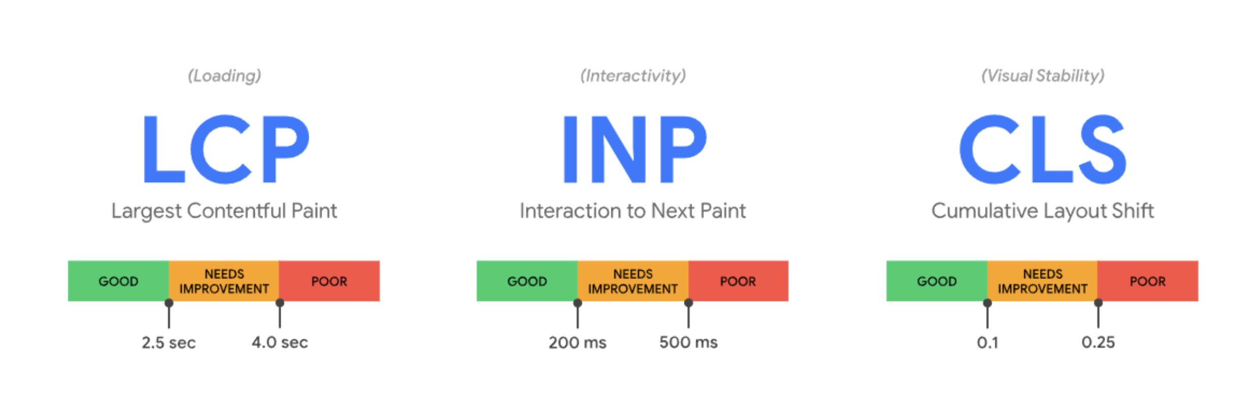
Performance, Core Web Vitals, and Perceived Speed
Performance lives at the intersection of engineering reality and human perception. Search engines measure it. Users feel it. The two are related, but not identical. You can pass every lab test and still frustrate people if the experience feels sluggish or unstable.
Core Web Vitals provide a useful floor, not a finish line. They capture important technical signals, but users respond more strongly to whether a page appears ready, stable, and responsive in the moments that matter. Perceived speed often determines trust before any metric has fully resolved.
The most effective performance work focuses on readiness, not just completion:
- Remove or defer scripts that block early rendering and delay interaction
- Prioritize visible content so pages feel usable immediately
- Optimize images and assets with the goal of clarity first, fidelity second
- Stabilize layouts so content doesn’t jump or shift as it loads
Measurement should mirror this dual reality. Lab metrics help diagnose issues, but field data reveals how people actually experience them. Track indicators like interaction readiness, layout stability, and input delay alongside behavioral signals such as rage clicks, abrupt scroll stops, and early session abandonment. When frustration shows up in behavior, performance is usually part of the story.
Performance improvements also expand access. Designing for slower networks, older devices, and assistive technologies doesn’t just improve inclusivity, it improves perceived speed for everyone. When pages feel fast, stable, and ready, users stay. Search systems notice. And the experience earns trust before a single word is read.
Mobile-First and Multidevice Experiences
Mobile is the baseline. Design priorities that work on small screens usually translate well to larger ones, not the other way around. Additionally, most search engines use Mobile-First Indexing. Sites that have a subpar mobile site experience can expect similarly poor SEO rankings.
- Prioritize content hierarchy so the primary message appears above the fold on mobile.
- Make tap targets large enough for thumbs and keep interactions simple.
- Avoid intrusive overlays at the moment of intent, and keep forms minimal.
- Eliminate Hovers: “Click/tap” and “swipe” gestures are mobile-friendly. If a navigation relies on hover states, it will not translate well to mobile.
- Ensure navigational labels, site sections, and headings are concise and clear. Write content with this same conciseness in mind (users scan on mobile, they don’t read).
- Consider ways to present a simplified site structure on mobile (think progressive disclosure in menus).
Users often switch devices during a decision. Design consistent flows across mobile, desktop, and other touchpoints. Keep key content and states accessible between sessions so someone who starts on mobile can finish on desktop.
AI-driven personalization can adapt experiences by device or context. Use that cautiously. Personalization should respect clarity and predictability, not surprise people with inconsistent layouts.
Accessibility as a UX, SEO, and Brand Advantage
Accessibility is often framed as a legal requirement or a box to check. In practice, it’s one of the most reliable ways to improve usability, clarity, and reach at the same time. Experiences designed to work for more people tend to send stronger, cleaner signals to both users and search systems.
At its core, accessibility is about removing unnecessary friction. When content’s easier to perceive, navigate, and understand, more visitors can engage without effort or confusion. That benefits users with assistive needs, people on older devices or slower connections, and anyone encountering your site in less-than-ideal conditions.
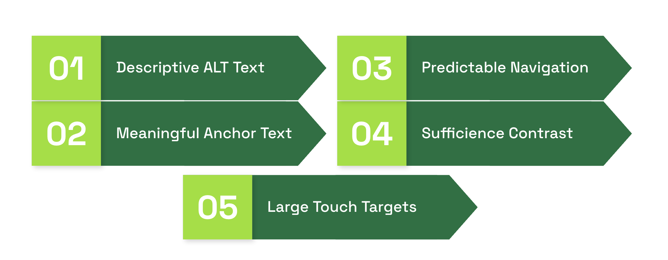
Foundational practices still matter, and they tend to pay dividends beyond compliance:
- Descriptive alt text that explains purpose and context, not just appearance
- Meaningful link text that clearly communicates destination and intent
- Keyboard navigation with visible focus states so interactions feel predictable
- Sufficient contrast and readable text sizing across devices
- Large, forgiving touch targets for links and controls on both mobile and desktop
These choices improve comprehension and reduce errors. They also make content easier for automated systems to interpret, which can support discoverability and performance in search. Clear structure, explicit labels, and consistent interaction patterns help algorithms understand what matters and how pieces relate.
Accessibility shouldn’t be treated as a retrofit. When it’s introduced late, it feels expensive and restrictive. When it’s built into the design from the start, it improves the experience for everyone and makes future optimization easier.
There’s also a brand dimension that’s easy to overlook. Accessible experiences communicate care, competence, and trust. As search and AI systems increasingly reward satisfaction and clarity, designing for broader usability becomes a form of ethical optimization. It aligns what’s good for people with what performs well, turning accessibility from a perceived obligation into a lasting advantage.
Key UX Metrics That Matter for SEO
Translate metrics into action. For example, if scroll depth is low on long pages, try stronger headings, a clearer summary, or embedding a sticky table of contents. If engagement time is high but conversions are low, test clearer CTAs or simplified forms.
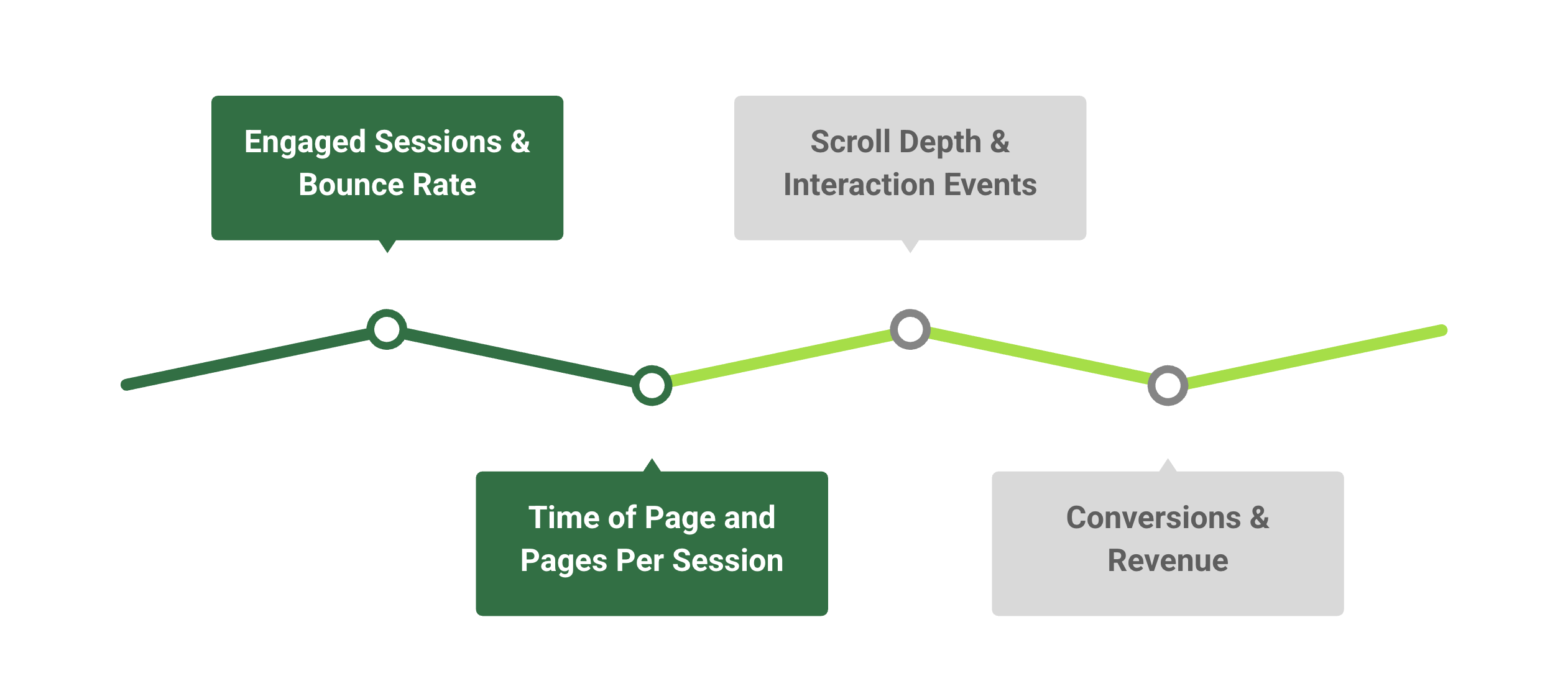
Use AI or analytics assistants to spot hidden patterns, but validate recommendations with small experiments. Metrics guide hypotheses, design tests confirm causation. What works for one page may not work for another.
Action-oriented pages might benefit from elevated CTAs, supporting content and clear next steps. Other pages might be looking for lengthier sessions, longer engagement time, and need to measure success in completely different ways. Think of user intent when designing a page, and test with that user in mind.
Bringing AIO into the UX–SEO Workflow
Optimization is most effective when it’s deliberate, iterative, and evidence-driven. AIO helps teams move faster without losing control: spotting patterns, testing ideas, and improving experiences while keeping humans firmly in charge. It’s not about letting AI decide or generate content; it’s about using AI-informed insights to amplify judgment, guide experiments, and measure what actually works.
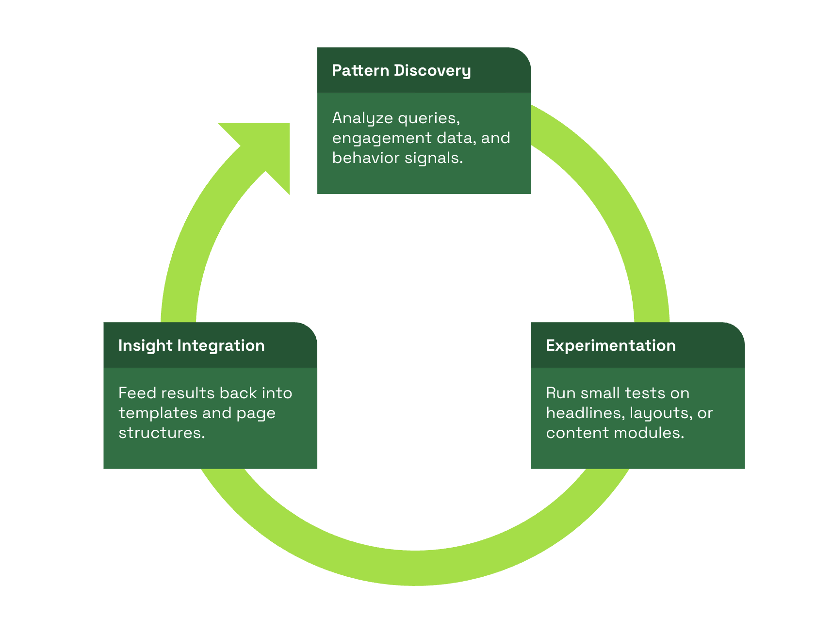
There are three moments where AIO consistently delivers leverage:
- Pattern discovery
- Before you optimize, you need to understand where effort matters. AIO helps surface patterns across queries, behavior, and engagement signals. For example:
- Group related questions into topic clusters to reveal intent subtleties
- Identify where users struggle, pause, or drop off, highlighting friction points
- Map these insights to content gaps, microcopy, and UX flows
- Before you optimize, you need to understand where effort matters. AIO helps surface patterns across queries, behavior, and engagement signals. For example:
- Option Discovery
- Optimization is about learning quickly, not guessing. AIO accelerates experimentation while keeping humans in the loop:
- Generate multiple headline or introduction variants for testing
- Measure engagement signals such as scroll depth, click patterns, or dwell time
- Feed results back into templates or design modules to standardize successful patterns
- Optimization is about learning quickly, not guessing. AIO accelerates experimentation while keeping humans in the loop:
- Signal Amplification
- AI can flag potential issues faster than manual audits:
- Highlight content readability or clarity gaps
- Surface misalignments between user intent and page content
- Identify structural issues or underperforming layouts
- AI can flag potential issues faster than manual audits:
These outputs guide human editors and designers toward the changes that will have the greatest impact.
The Future of UX-Driven SEO
Search and discovery are converging on one truth. Pages that serve people with clarity, speed, and trust earn better results across organic and product channels. Teams that keep experience at the center, and use models and tools to test rather than to decide, will win steady gains.
Stop treating UX, SEO, and AIO as separate tracks. Design a loop that starts with research, moves into design, measures outcomes, and refines based on evidence. That loop turns one-off wins into compounding advantage.